How innovative companies use design thinking

Customer satisfaction is absolutely vital to the success of any product. Without it you’re destined to fail, fast. And yet, too many companies overlook their customers’ needs — using output and being ‘first to market’ as the metrics that matter.
But here’s the thing: being first isn’t an advantage if the product itself lacks relevance or traction. That’s why tech giants such as Google, Apple and Samsung have all embraced the design thinking methodology, with other companies looking to do the same.
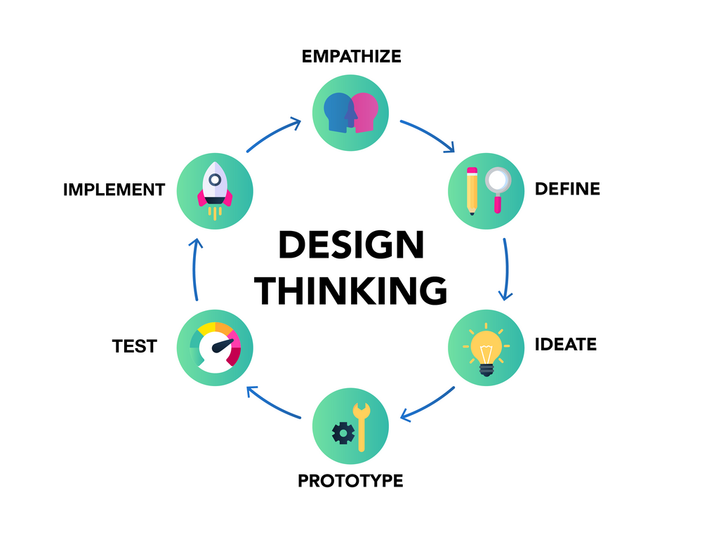
Design thinking is an iterative process that keeps the user at the center of every decision. It encourages an integrative view and accepts uncertainty. It also helps product teams to consider every angle of a problem, before exploring creative solutions with the customer in mind.
So which companies are using design thinking the best? And what can we learn from the products and services that they developed?
5 companies using design thinking to create user-centric products and services
Braun/Oral B - the next-gen, smart toothbrush
Braun and Oral-B are well known for their electric toothbrush line, but when it came to creating a new brush with smart features they had a problem on their hands. The initial idea involved a sophisticated data-tracking module that would be able to sense how the user was brushing. It would collect information about interactions with every individual tooth and offer feedback to the user about gum health. It would even be able to play music!
The companies brought in Kim Colin and Sam Hecht, founders of the London-based industrial design studio Industrial Facility, to help them realize their vision. As design thinking experts, the duo looked at the design brief and found some immediate issues.
Rather than thinking about a customer’s dental care needs, Braun and Oral-B were approaching the new product as if it were a fashionable fitness or wellbeing tracker. Many of the features they wanted to include served purely as gimmicks — they would give the illusion of essential benefits, but actually held little value to the end user.
Instead, Colin and Hecht shifted focus towards issues that customers were finding with existing toothbrush lines. They decided the two features that would provide the most benefit for users were better charging and replacement brush heads.
Currently, users were able to charge their brushes via a dock, but charging on-the-go proved less convenient. To fix this issue, Colin and Hecht incorporated USB ports to allow the user to charge their brush via outlets or even a laptop.
Reordering replacement brush heads was already a simple task, but while users would notice their brush heads were worn down, they would forget to order replacements. To combat this, the designers created an app that connects to the brush via bluetooth. Users can then press a button on the brush to send a message to their phone reminding them to order replacement brush heads.
By utilizing design thinking — and empathizing with what the user was actually experiencing — the companies were able to shift their focus from gimmicky pseudo-features to a product that passed on real value to the customer.
Stanford Healthcare - improving the ER experience
During a two-day design thinking course at the Hasso Plattner Institute of Design at Stanford, a group was tasked with improving the patient experience in the hospital’s emergency department. For the experiment, they played the roles of patients and their family to simulate the feeling of a chaotic atmosphere normally found in the ER. It may not have been the first place people would consider using design thinking, but design thinking is an empathetic process and was perfectly suited to the task.
They started by interviewing patients and families about their experience before recreating the experience for themselves. Design strategist and co-teacher Emilie Wagner noted that the simulation “added an emotional value that complemented the interviews.” She also described the design thinking process as “a tool that encourages students to step out of designing for themselves and trust the people they’re designing for.”
The design thinking experiment brought to light a need for coordinated and clear communication. After all, that’s what’s going to reassure patients during the heightened anxiety and fear of an unwanted ER visit. The experiment’s success led to Stanford Healthcare administrators incorporating design thinking into the planning of a new hospital building.
Nike - sportswear for sports lovers
Nike is one of those companies that has embraced design thinking for a long time — and the results speak for themselves. In fact, Nike CEO, Mark Parker, believes it should be “infused” into everything the company does.
The needs of their sporting partners have always been first and foremost in Nike’s design process. In fact, the Air Force One was originally designed to help athletes perform better as the first sneaker to incorporate their trademark pressurized air technology. To their surprise, they became a fashion sensation on the streets of New York and formed a long lasting bond between Nike and the NYC community.
While fashion and style is important — a fact that is reinforced by the huge “sneakerhead” community who are passionate about every new release — performance and innovation must always come first for Nike. That’s why design thinking, with its user-centric focus, is the perfect methodology to keep the brand on top.

Airbnb - walking a mile in users’ shoes
A little over a decade ago, Airbnb was on the verge of bankruptcy. Revenue barely hit $200 a week and its founders were floundering while trying to manage their losses. As they investigated the root cause, they realized their advertising campaigns were lacking high quality images. And, most importantly, their ads and website listings weren’t showing everything the unique accommodation brand had to offer.
This meant potential customers had little to no idea what they were paying for.
Their first solution was simple: go to the properties, rent a camera and take the pictures themselves. Sure, that got the job done for a brief time, with turnover doubling to $400 a week, but it was far from scalable. They needed to rethink.
As is often the case, a better solution was sat right opposite them: their new and growing team. Moving forward, new hires would be tasked with making a trip to each new listing and documenting their experience. This allowed employees to see the problems potential customers were facing — then come up with creative solutions.
For example, the app’s system for rating properties was originally a traditional star system. That was until a member of Airbnb’s design team realized that users would reward hosts in a colder fashion with the star system and replaced it with the heart scale we know today. While this may seem like a relatively minor change, the replacement rating system was credited with a 30% boost in business!
Thanks to design thinking, Airbnb has gone from the brink of bankruptcy to disrupting the tourism industry worldwide. The digital experience their website provides solves user issues effectively — for travelers and hosts alike.
Uber - changing lanes with UberEats
When Uber made its first steps into food delivery, they knew that their customers would expect the same seamless experience they were used to with Uber’s cars. Thanks to design thinking, the company has achieved just that and UberEats is now one of the top food delivery services in 24 countries across the world.
The UberEats design team lives and breathes design thinking to ensure its users receive the maximum value. That’s true whether they’re a restaurant looking to expand their business, a delivery partner looking for flexible ways to earn money, or just a hungry person looking for a quick bite to eat.
To understand their different markets, Uber designers visit a city where UberEats operates and immerse themselves in the culture and infrastructure. They interview delivery partners, restaurant workers and consumers to gain insight from every user. They also perform “order shadowing”, where the designers can observe the experience in action. This involves visiting restaurants during busy periods and actually sitting in customer’s homes while they order.
Lastly, they offer “fireside chats” with their customers to gain insights directly. They invite delivery partners, restaurant workers and consumers into the Uber offices and encourage candid conversations about what matters to them most.
UberEats’ commitment to design thinking is one of the strongest examples of its benefits. They understand that every user persona is central to a successful product, so it’s no surprise that the venture has proved hugely successful across multiple markets.
Design thinking workflows made easy with EasyRetro
EasyRetro may be known for its amazing retrospective templates, brainstorming tools and anything else you may need to run a successful sprint, but our value doesn’t end there.
We love design thinking and the benefits it brings. So we want to bring design thinking and agile workflows together. Our experts can help you find the right tools for your team and offer design thinking templates to help you transition smoothly.
We’ve helped teams improve in more than 2,000,000 retrospectives and now we’re here to help you. Let’s get started today.